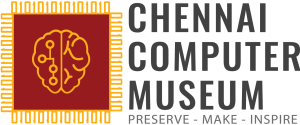
Hello friends, we have a new logo!

Some of the thinking that went in the construction:
- Red/Yellow for colors of Chennai
- Microchip, that is the foundation of the Computer revolution
- 1’s and 0’s surrounding the chip as pins, to illustrate binary as building blocks. (We could perhaps encode a small message as binary?
 )
) - At the center, we have a brain with a circuit half – signaling the fact we are in an era where Computers do a lot of thinking and decision making for us (AI, autonomous vehicles etc). It also indicates the center will nurture creativity & innovation.
- The slogan ‘PRESERVE – MAKE – INSPIRE’ to signify what the museum will be promoting.
What do you think of the new logo? We most likely would go through a few iterations of the logo until the construction of the museum. Your feedback will be very valuable!

